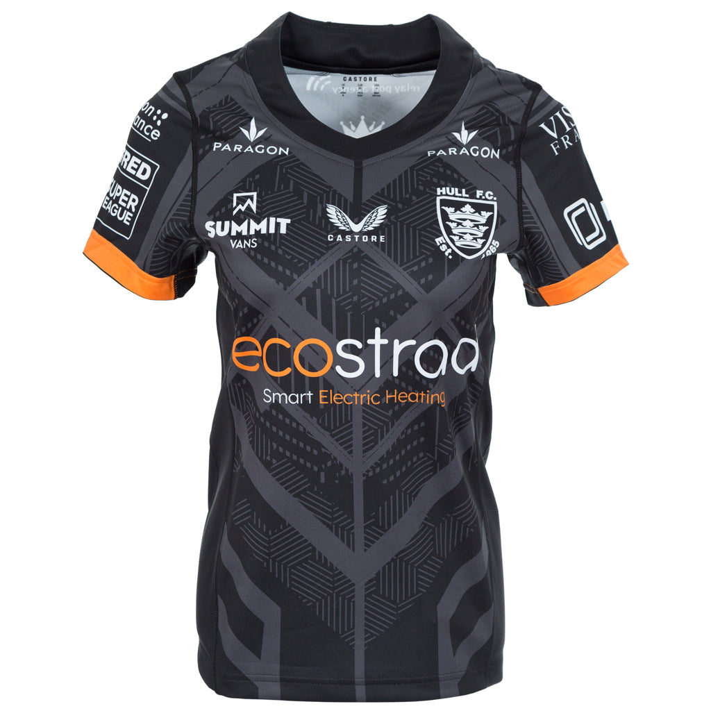
bonaire wrote:By far the best design of the three kits,looks great and modern.
This should be the clubs home kit.
The other two are very poor from a design aspect with boxes just added to a basic shirt colour
The other two are OK, we've had far better but I've seen worse. Not a fan of the big black centre band on the home shirt. Nice shade of blue on the away. Sponsors logos at least match the shirts.
I agree that the third shirt is the best though. Hopefully we'll see it more than just the Magic fixture and maybe one cup game.
