Joined: Aug 17 2009 Posts: 1116 Location: Isle of Axholme
I know it's along way off but these things are planned in advance and i wondered if the club would like a bit of input from the fans as to what they would like to see? This seasons effort is quite good with the Tattersfield retro design. Would you be happy to keep the same again or maybe go for a more modern design? Personally i liked the original 1951 design with the collar as worn in the Workington game last year. I would be happy to go with something similar to that or stick with what we have got.
Cant find a pic of it but I loved the Red Stripe sponsored top from mid 90's the 2 versions were great but the away had more white in it and really stood out... I believe Villa had several pics in it but cannot find anywhere.. still see someone wearing it occassionally at the games. It looked a bit like a rams horn around the top of shoulder... If anyone knows which one I mean please post it!!!
There's no I in team......but there is a me!
'It is not enough to be interesting, you must first be interested'
How about the Miami Dolphins look! I quite liked that quartered mularkey we had at Stainy. To be honest I liked the LA Rams look. My fave though is the old yellow & blue hooped second kit we had in the Parky era.
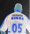
I'd like something like these, not too different from this year but with a white away shirt. I've redone the logo again as well. What do people think of this version?
I'd like something like these, not too different from this year but with a white away shirt. I've redone the logo again as well. What do people think of this version?
I'd like something like these, not too different from this year but with a white away shirt. I've redone the logo again as well. What do people think of this version?
I've always liked the "Manly" hoops design and those two look good but the Dons logo needs bringing into the twenty first century. It looks like a 1950's school uniform badge.
The Prodigal Don wrote:
I'd like something like these, not too different from this year but with a white away shirt. I've redone the logo again as well. What do people think of this version?
I've always liked the "Manly" hoops design and those two look good but the Dons logo needs bringing into the twenty first century. It looks like a 1950's school uniform badge.
rupert bear wrote:That looks really good but i think we need to keep with the same one rather than chopping and changing every couple of years.
In general every RL side changes their kit year on year sometimes with dramatic effect, i do like that idea, as when (once in a blue moon with the Dons) you have a great season, that certain kit can become iconic.
John Part BDO world champ 1994...PDC world champ! 2003 2008
Joined: Aug 17 2009 Posts: 1116 Location: Isle of Axholme
Up the Dons wrote:In general every RL side changes their kit year on year sometimes with dramatic effect, i do like that idea, as when (once in a blue moon with the Dons) you have a great season, that certain kit can become iconic.
Users browsing this forum: No registered users and 167 guests
You cannot post new topics in this forum You cannot reply to topics in this forum You cannot edit your posts in this forum You cannot delete your posts in this forum You cannot post attachments in this forum