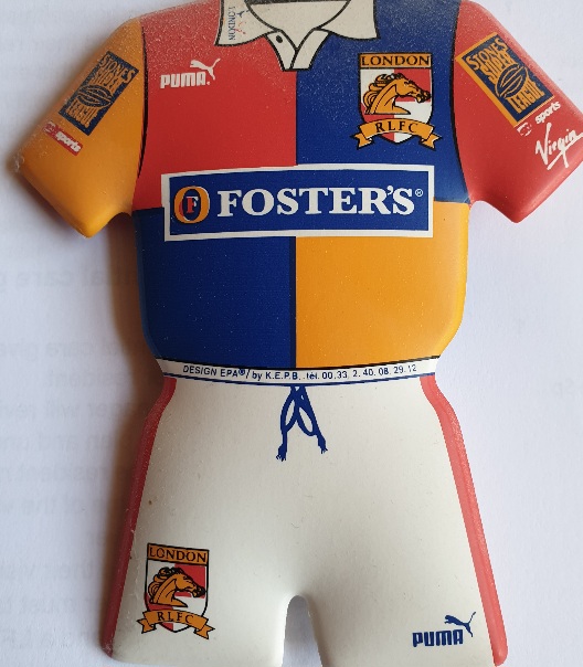
BigTime wrote:I like it and think it’s quite stylish, pending what they do with sponsors logos (assuming we get them this year), however I can definitely see the argument that it is the laziest design of all time and someone has pulled an absolute flanker. On balance I’m going with deliberately Minamalist and stylish rather than the latter.
Its very slowly growing on me. I was quite disappointed on initial viewing. Hopefully we do something more than just slap the sponsor logos on and actually make them part of the design.
If we are going to go minimalist/understated for the home jersey, then I'd like to see us do something a bit more eye catching for the away version. Especially with the extra SL exposure. Errea do have a lot of fun designs from outside of Rugby/Football that might be transferrable.